
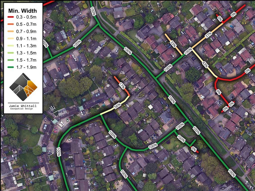
Footways get treated too simply in planning. A route either has a footway or it does not. A site is either walkable or it’s not. It’s very rarely that simple.
In practice, what matters is whether the route is continuous and wide enough to be genuinely accessible. That becomes more important under a “decide and provide” approach to transport planning, where the expectation is to support accessible travel rather than simply point to existing shortcomings.
The difficulty is that this sort of detail is not always obvious from a site plan or a desktop review. Highways officers and planners still need to understand how routes work on the ground, and that is where OS NGD footway data becomes useful.
The dataset includes average width, minimum width and percentage provision. Once that is pulled into GIS, it becomes much easier to see where the pedestrian environment is working and where it starts to fall down.
The obvious thing to look at first is percentage provision. That is helpful up to a point, but it can also be misleading. A route can score well on provision and still be poor for actual use if the minimum width drops too low. That is the sort of thing that matters for wheelchair users, people with prams, and anyone who is less comfortable walking in constrained conditions. Just because a footway exists does not mean it is doing the job people assume it is.
For site appraisal this is useful because it gives a more realistic picture of accessibility around a site. Instead of making broad statements about whether pedestrian links are available, you can start to see where the actual pinch points are and whether they undermine the route as a whole.
That is where the GIS side becomes valuable. It’s not just mapping for its own sake. It’s a practical way of testing how the area around a site is likely to function for pedestrians. If pedestrian accessibility is likely to be a live issue on a site, I can review OS NGD footway data in GIS as part of early site appraisal, and planning support work.